Saladin Pro
Saladin Pro is an application that specializes in selling insurance packages from health, maternity, motor vehicles, accidents, travel, home... in the form of affiliate. Saladin Pro has many features to support collaborators to easily sell products, increase income such as training knowledge, forming teams, upgrading levels,....
As a product designer, I have researched user needs and made significant improvements to the UI/UX of the app, let's see the steps I have taken
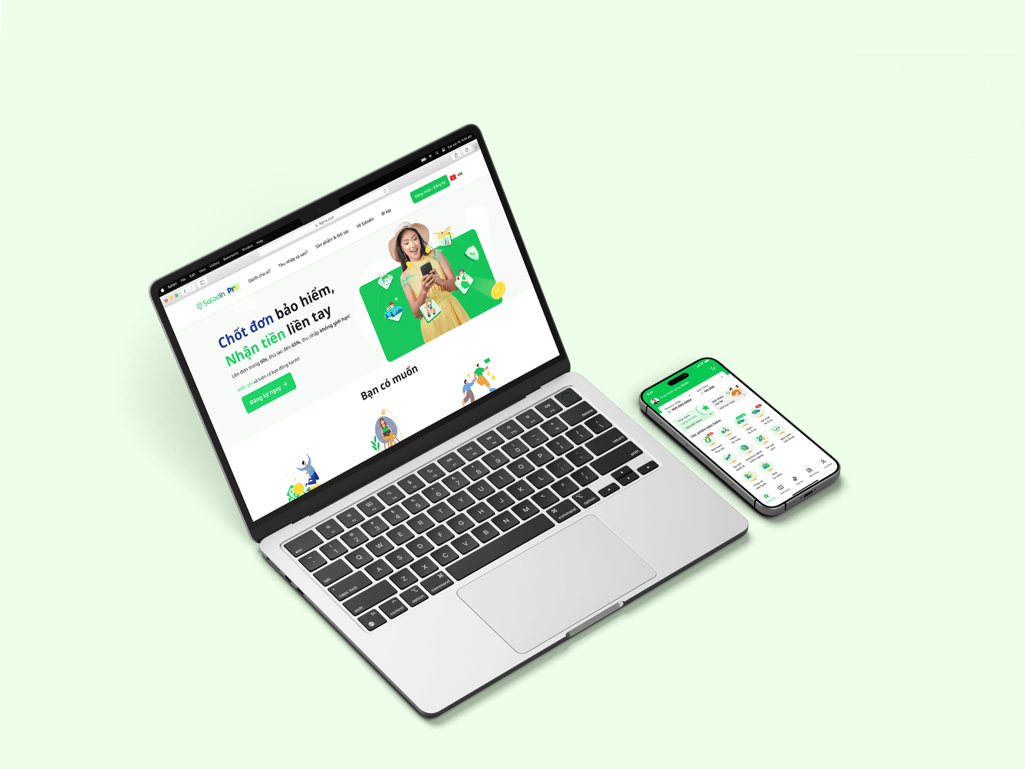
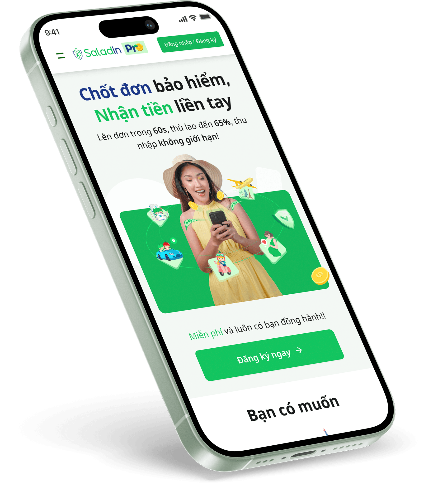
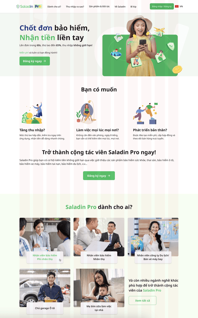
Revamp Homepage &
Navigation pages
PROJECT OVERVIEW
The Problem
Saladin Pro is a start-up insurance application that has just turned 1 year old. After 1 year of rapid construction and development, we reviewed and found many points that need to be improved to suit and meet the needs of users.
The Goal
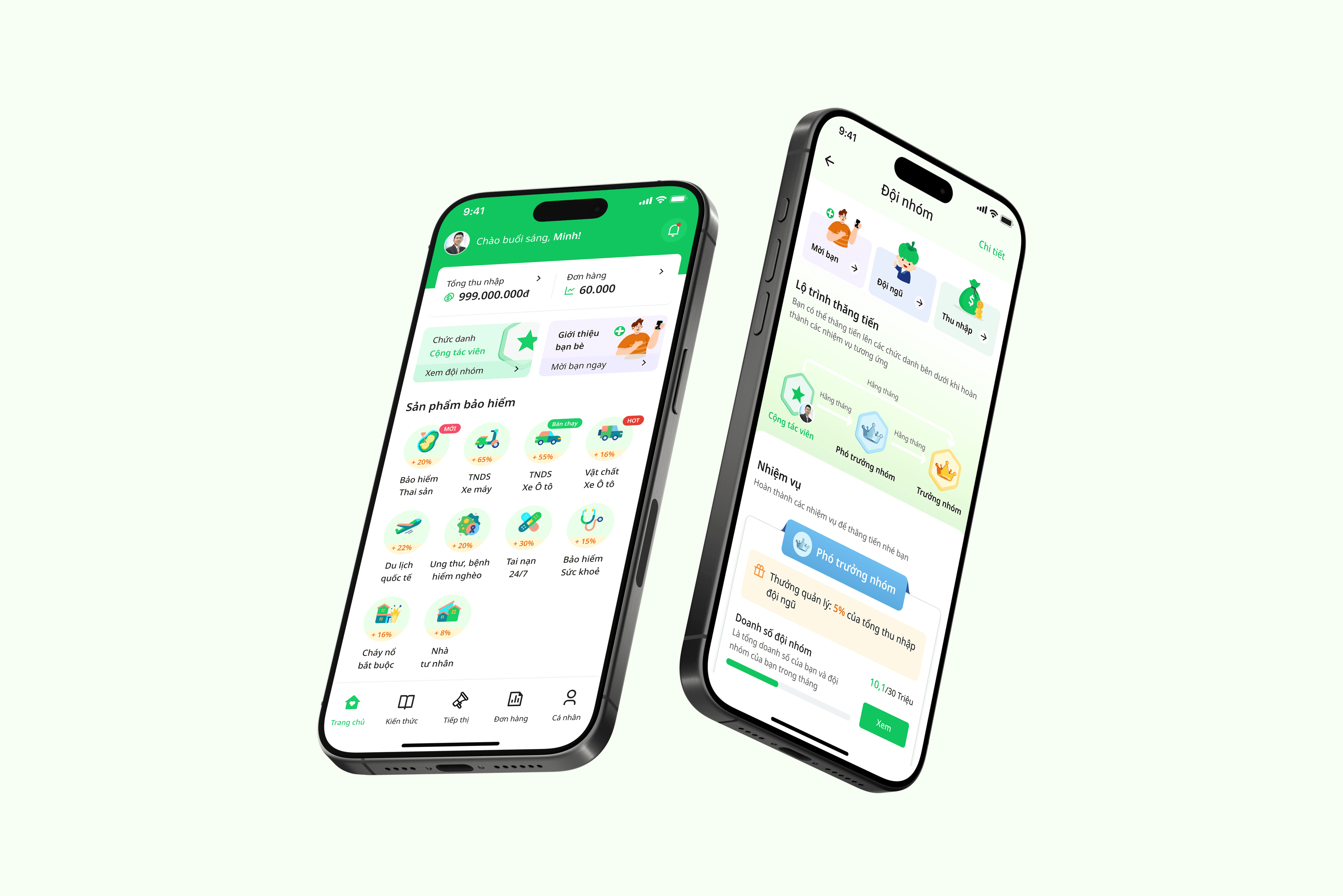
Redesigned Saladin Pro app home page and navigation pages, address the needs of end users and show the good features of the app, so that first-time users can know and complete their tasks easily and quickly
Redesign Saladin Pro landing page to meet the development requirements from the marketing team
Responsibilities
Conducting interviews, digital wireframing, low and high-fidelity mockups, handoff and dev support to UI, finality testing and conducting usability studies after release.
Duration
16 Aug - 30 Aug 2024
My Role
UX/UI Designer, Users Research, Users Interview
Process
Understanding the user
User research
Personas
Problem statements
User journey maps
Competitive audit
Starting the design
Digital wireframes
Low-fidelity prototype
Usability studies
Refining the design
Mockups
High-fidelity prototype
Accessibility
UNDERSTANDING THE USER
User research
Summary
Saladin Pro app users can be divided into two main categories: Team builders, team managers and salespeople. With two clear goals: Team builders, team managers, in addition to selling, they mainly aim to build a strong team, support team members to sell well, thereby creating profits for them. Salespeople, their goal is to sell as many products as possible.
I conducted interviews with some end users in both of these user groups to understand their needs and the pain points with current UI.
User needs & pain points
Tasks to do
New users log in without knowing what to do next.
Don't know where you stand, don't know what to do to make money
Hard to find features
The features are hidden deep inside, the buttons are small and hard to find, so it is quite difficult to guide users.
Product knowledge
Many new sellers do not have much knowledge about insurance so they cannot clearly advise customers and close deals.
Persona
Based on the insights from the research, I developed two main user personas that represent the target user, specifically their goals and pain points.
Persona 1:

Tung Nguyen
Occupation: Affiliate Leader
Location: Viet Nam
Education: University
Status: Married
“I had a hard time guiding people on my team through the tasks they needed to do. Also, many other features on the app were hard to find.”
Goals
Increase income
Build a team to increase income together
New salesperson guide
Frustations
Difficulty in finding the features to use
Difficulty in instructing others to use the app
Bio
Tung is a Affiliate Leader. He is 35 years old. He has more than 10 years of experience in insurance field. His goal is to sell and build his team to generate better income.
Persona 2:

Nga Tran
Occupation: Office Staff
Location: Viet Nam
Education: University
Status: Married
“I don't know what to do when I first sign up for the app, there isn't much information or it's hard for me to find out”
Goals
Looking for a side job to earn extra income
Frustations
Not much knowledge about insurance products
Bio
Nga is a office staff. She is 28 years old. Besides main job as office staff, she also wants to earn extra income from her free time. She also bought motorbike insurance and life insurance.
Problem Statement
Trung is a Affiliate leader, who needs to build team and mentor new people with ease because he feel it is quite difficult to use and find features in the app.
Nga is a Office staff, who needs learn more about the insurance industry and how to use the app because after loged in, she didn't know what to do next and the knowledge needed to increase sales.
Competitive audit
An audit of a few competitors' products provided direction on gaps and opportunities to make better for the new Homepage.
Invite friend
Fuse
MFirst
IZIon24
Team
Newbie Tasks
Level of agents
News
Training courses
After trying all of their features I summarized some pain points while using them, which become the opportunity areas for me to design the new feature.
Pain points
Agents after logging into the app do not know what to do next
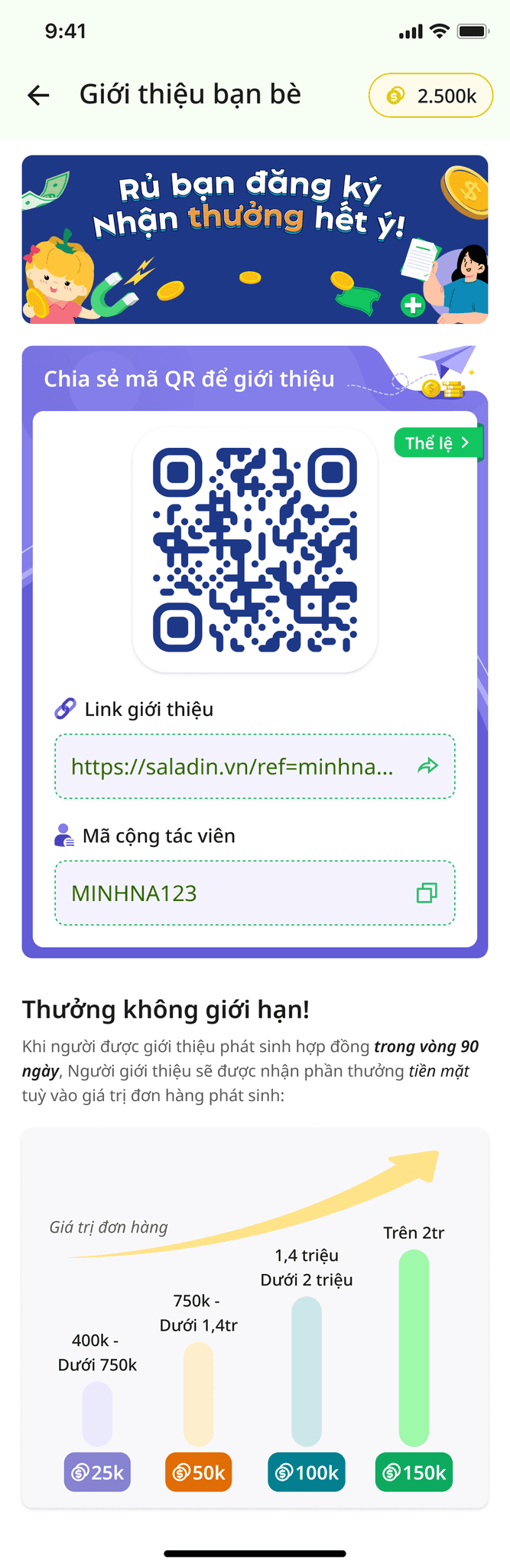
Sharing feature to expand the team difficult to operate
The information and features on the homepage are quite limited and simple, not providing good support for sellers.
Opportunity areas for Homepage & navigation page
Grow team
Highlight the Team feature so that agents can easily manage and develop.
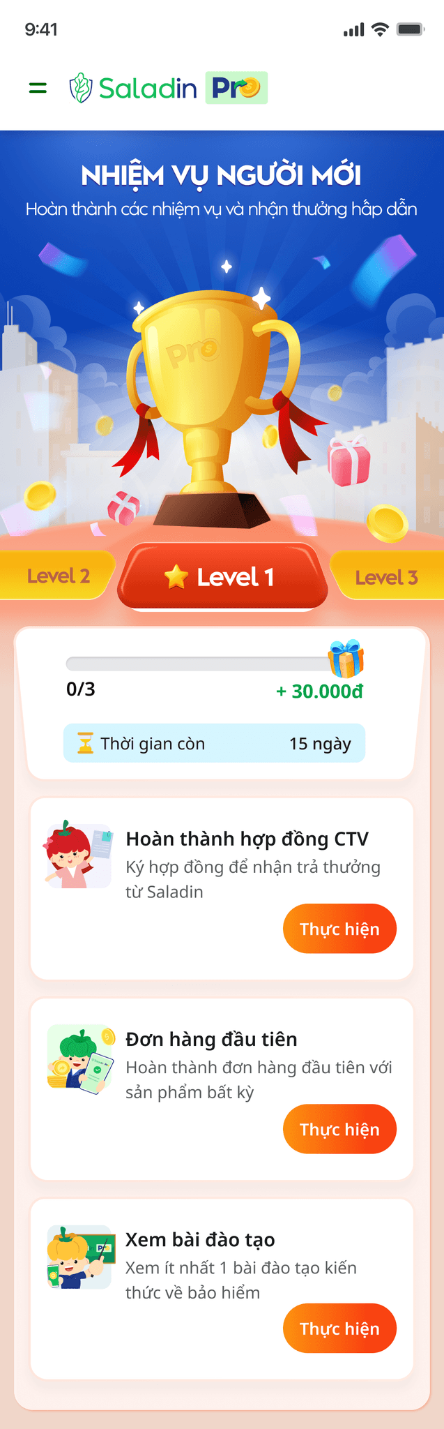
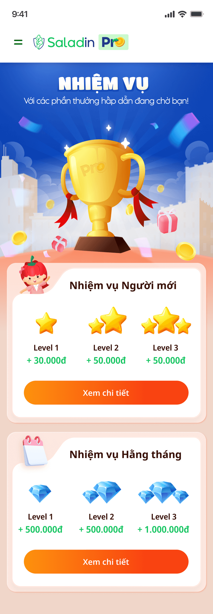
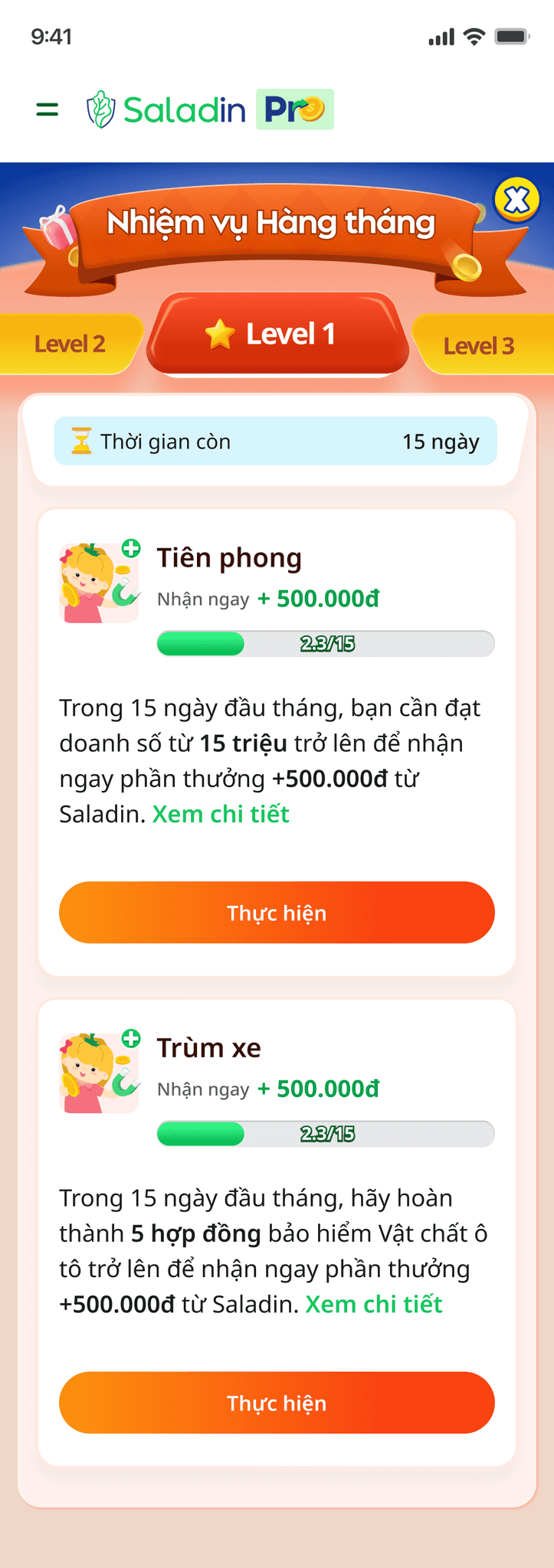
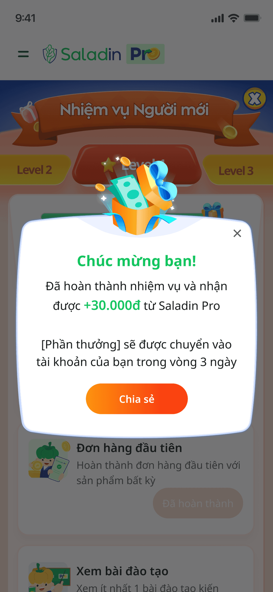
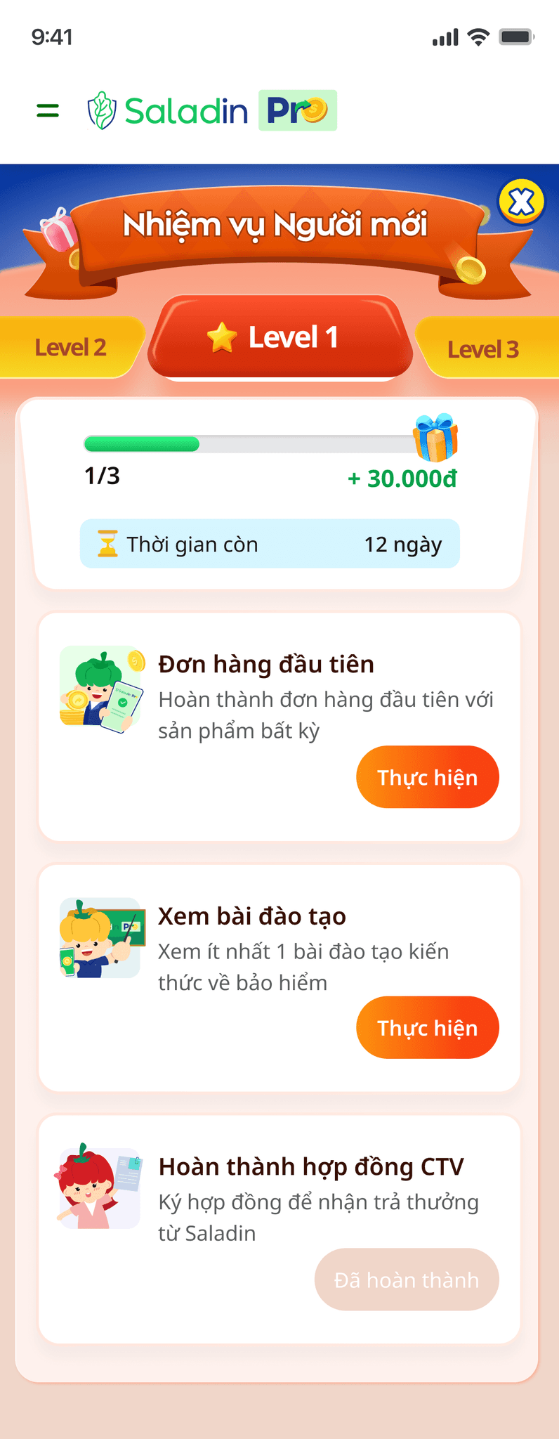
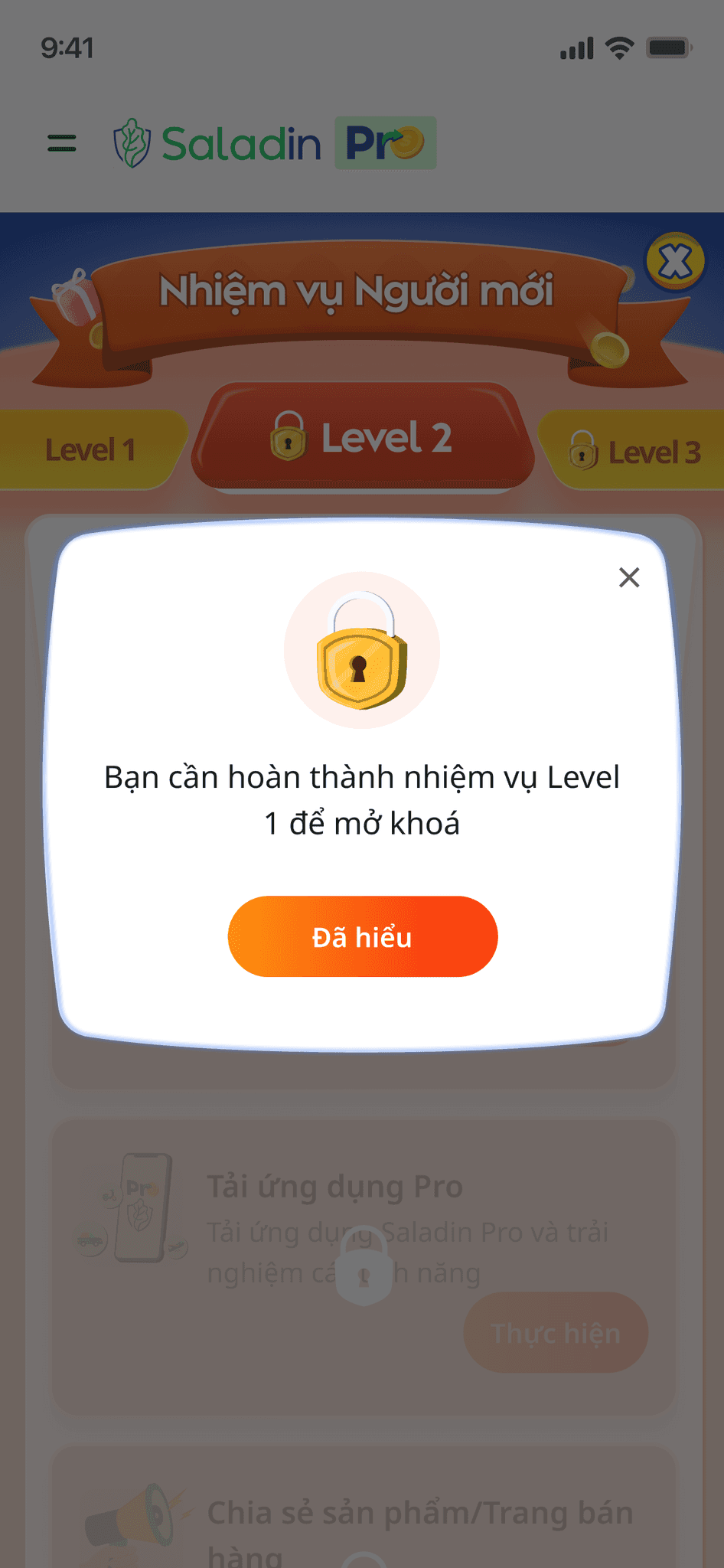
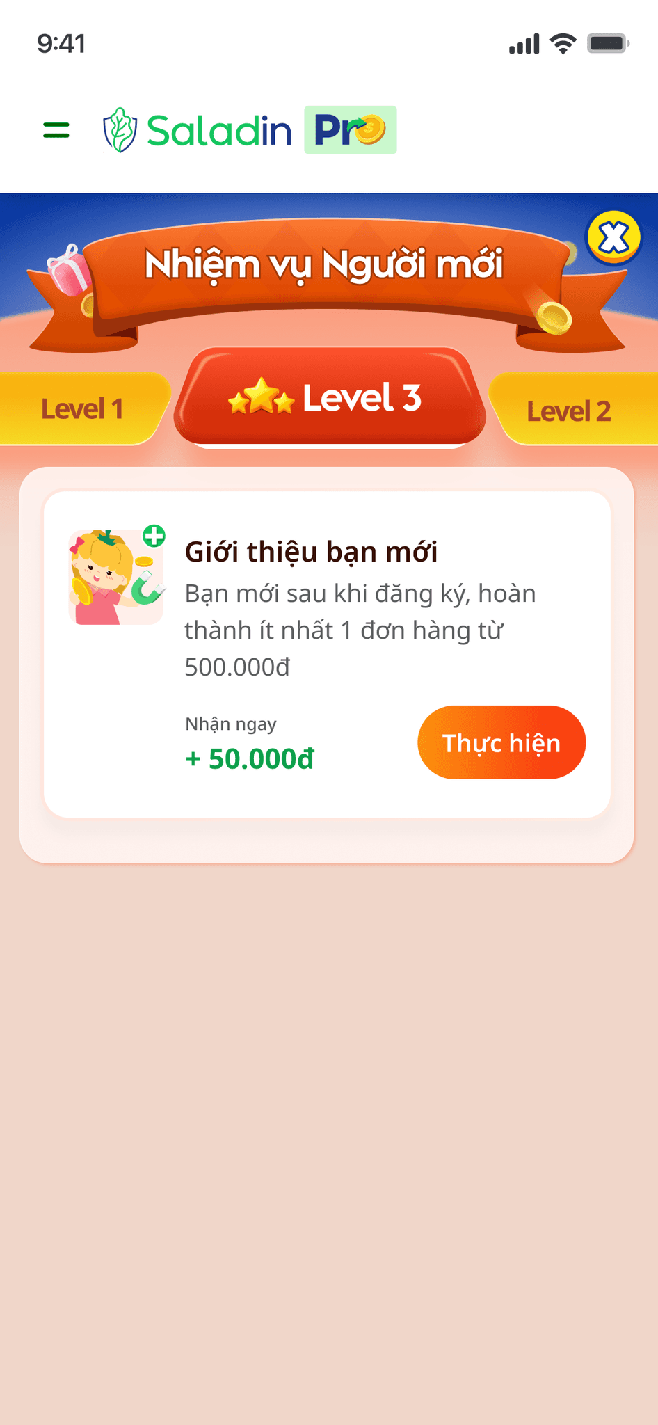
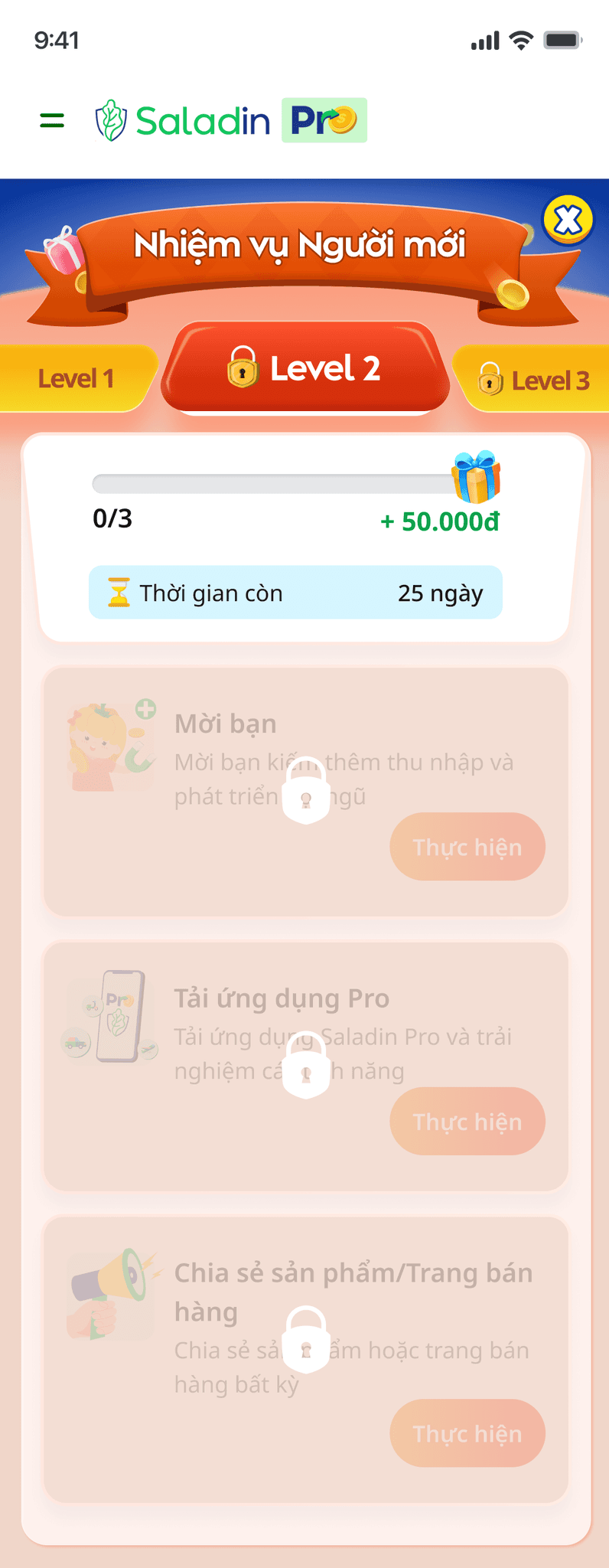
Newbie tasks
Show and alert a list of tasks that the new user needs to know and complete
Training courses
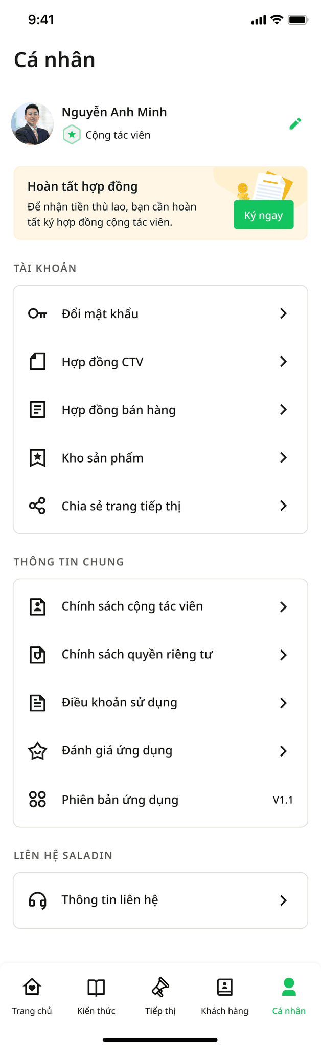
Redesigned the training feature so that users can both guide new users and new users can learn more easily.
STARTING THE DESIGN
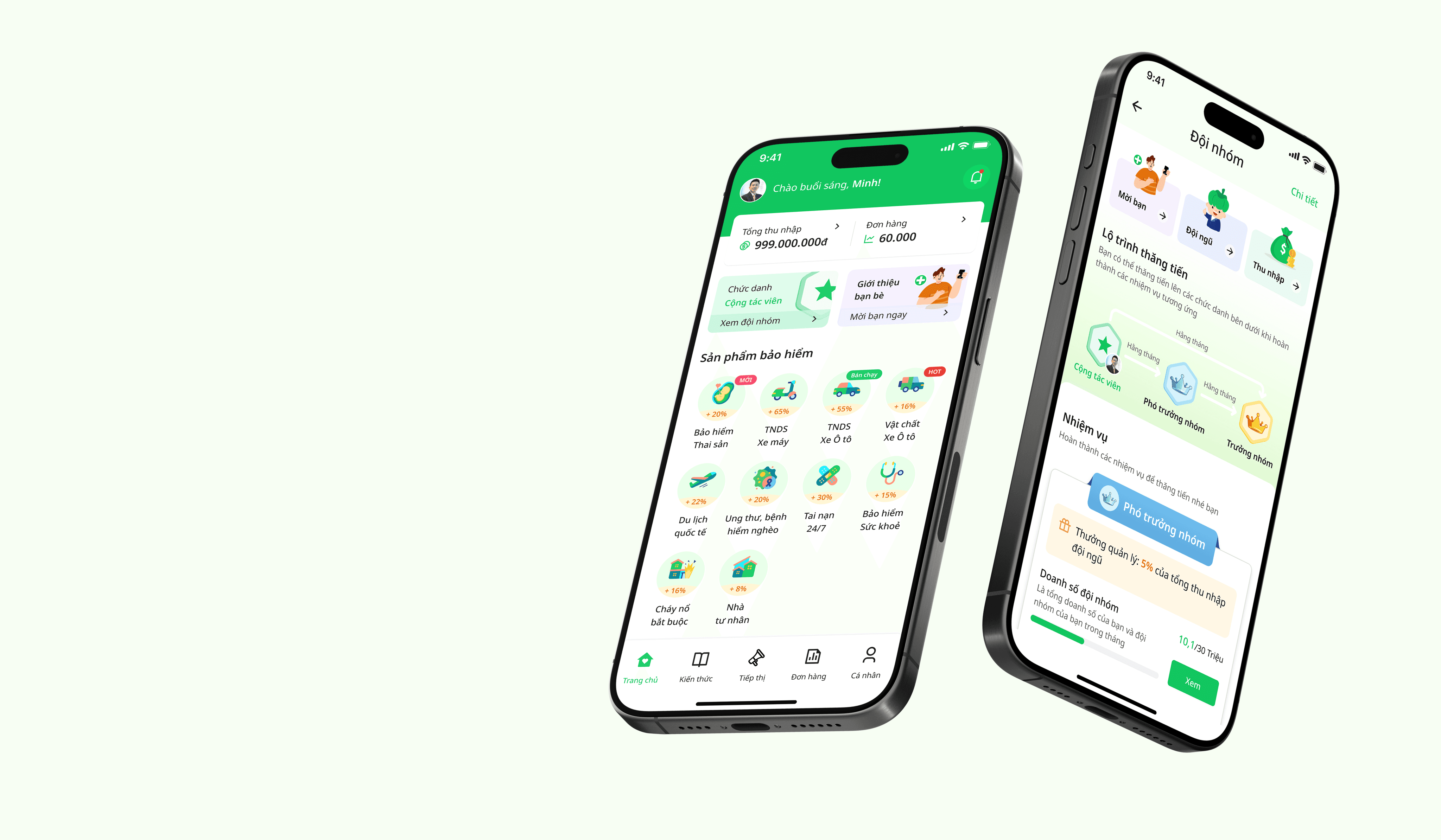
Homepage & Navigation pages
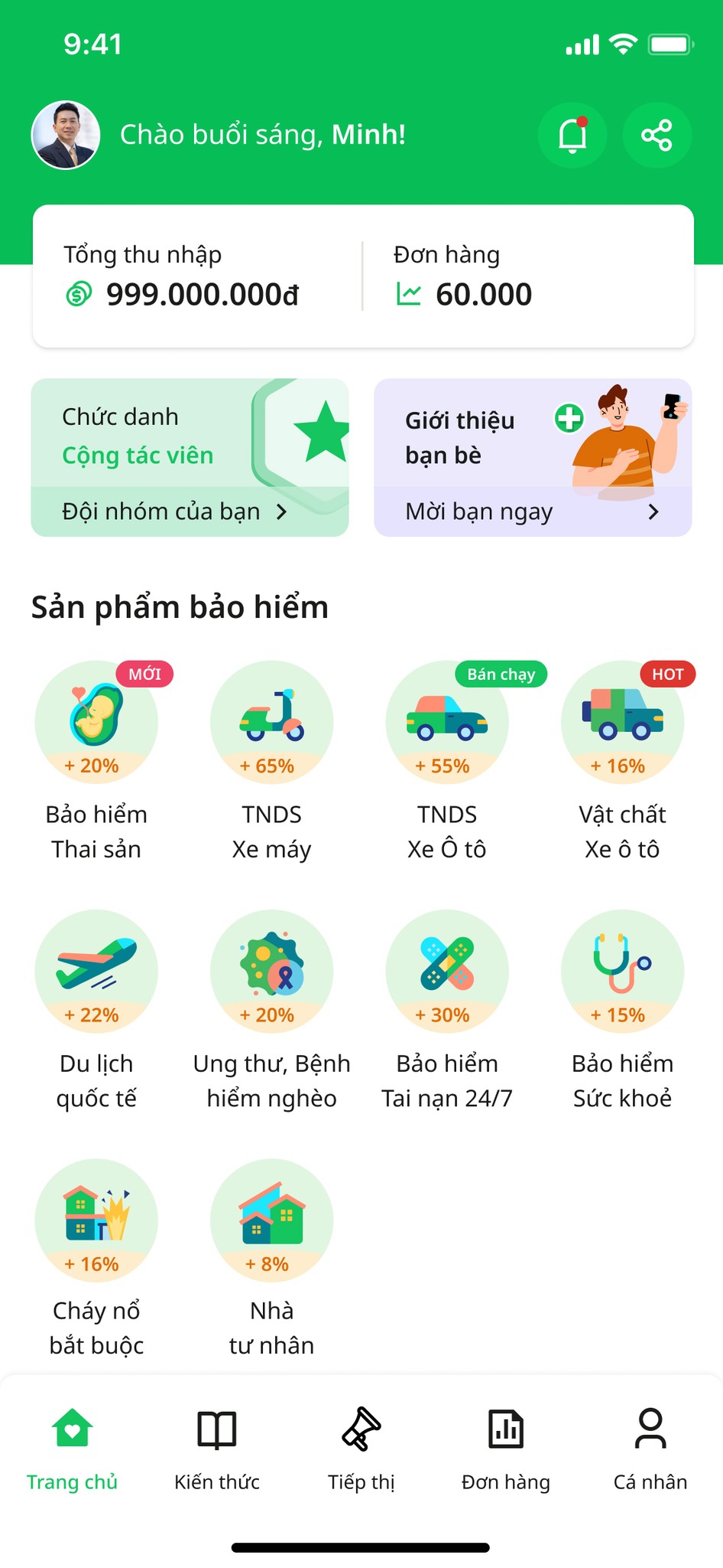
Based on the data and feedback after 1 year, I analyzed and redesigned 4 options for the home page, meeting the current needs of users and used it for userability testing with the main user group of the application.
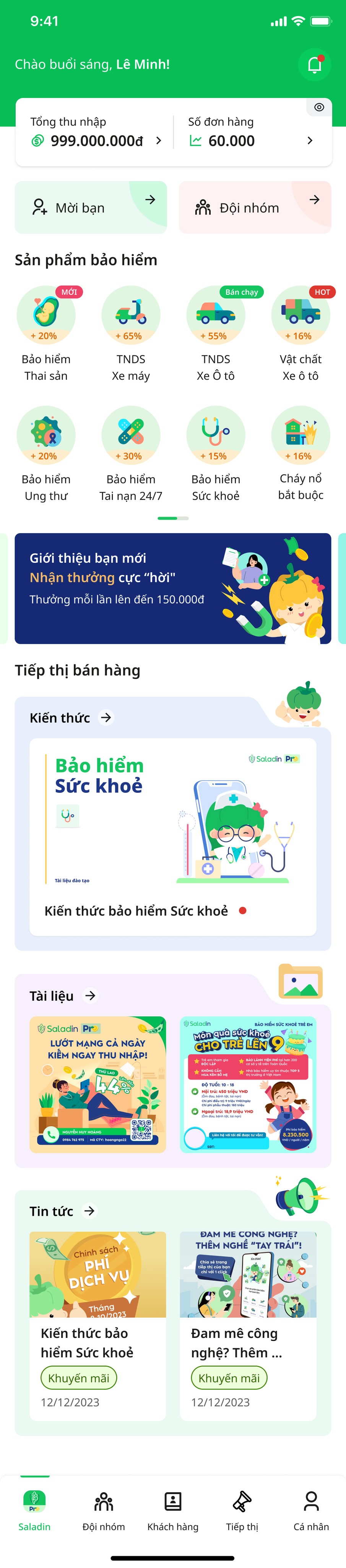
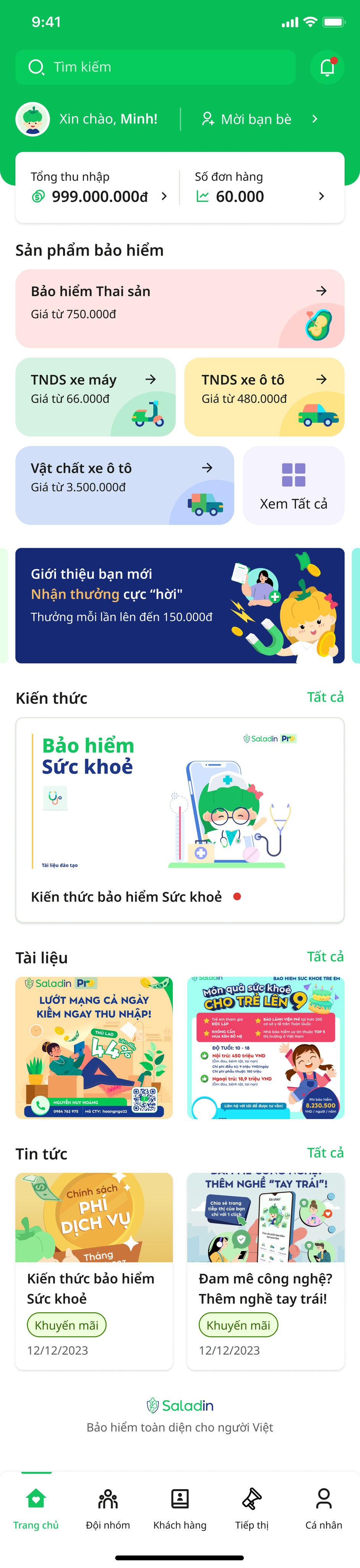
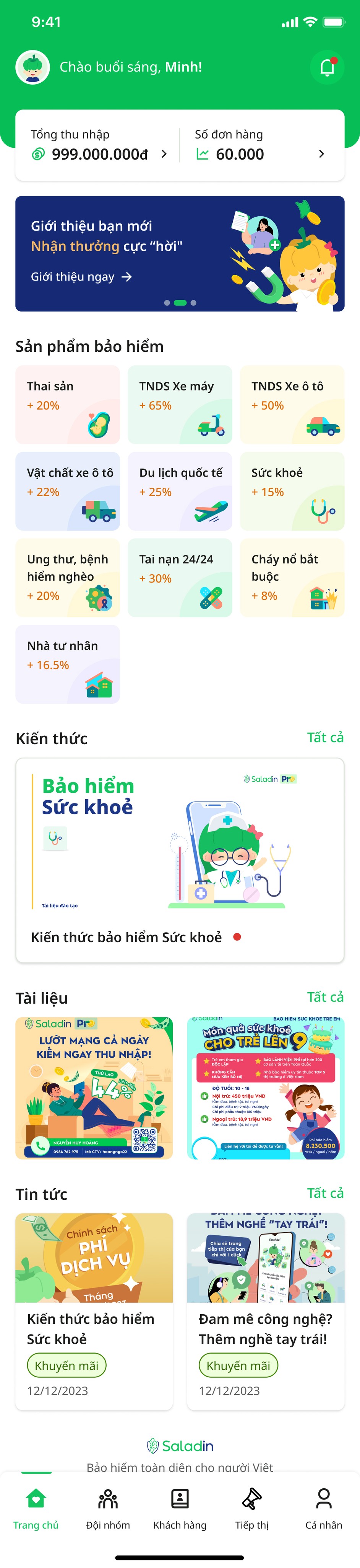
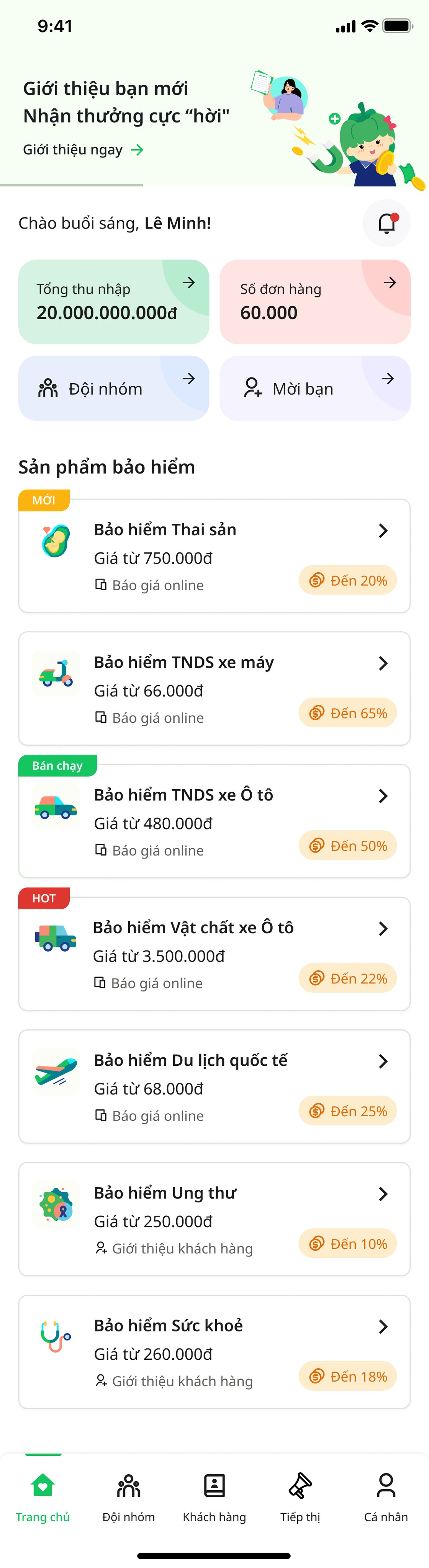
After performing usebility testing with 2 groups of users, the first option was selected and some improvements were made to better suit the needs of users:
Add avatar to show user's personality and pride
Remove the feature of hiding sales and orders because it is not necessary
Add alerts to guide each task that the user needs to complete

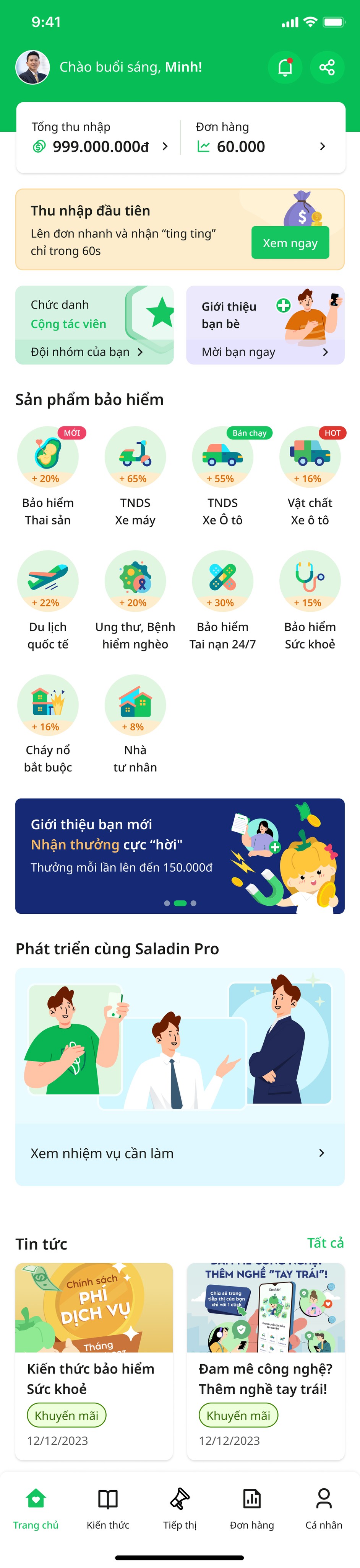
Displays for agent levels:
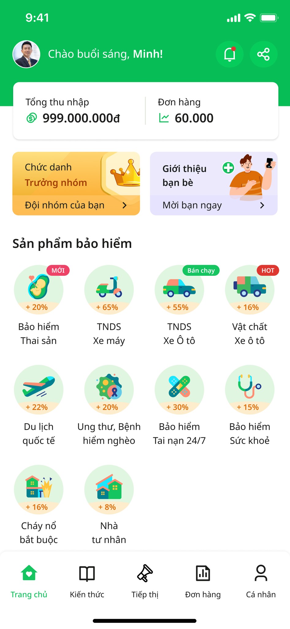
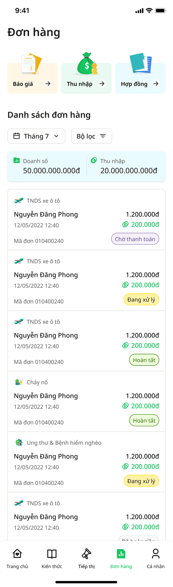
Some navigation pages updated
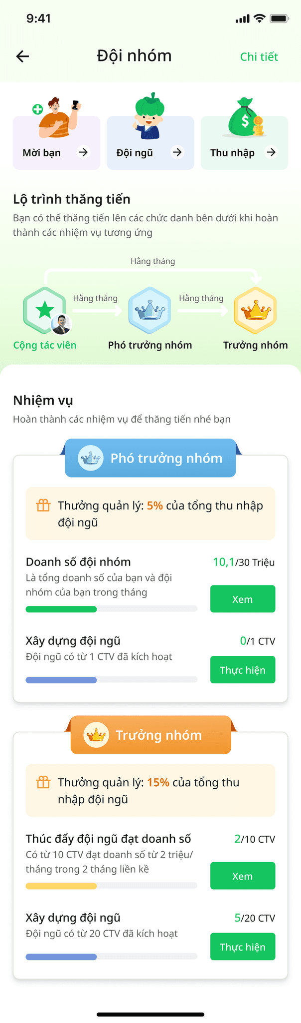
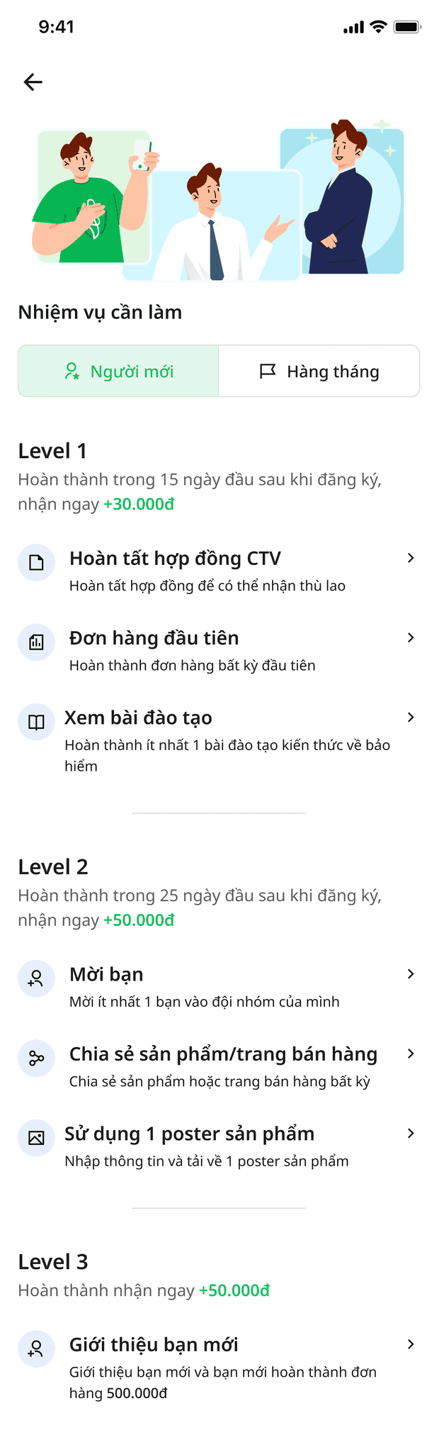
Newbie's mission campaign
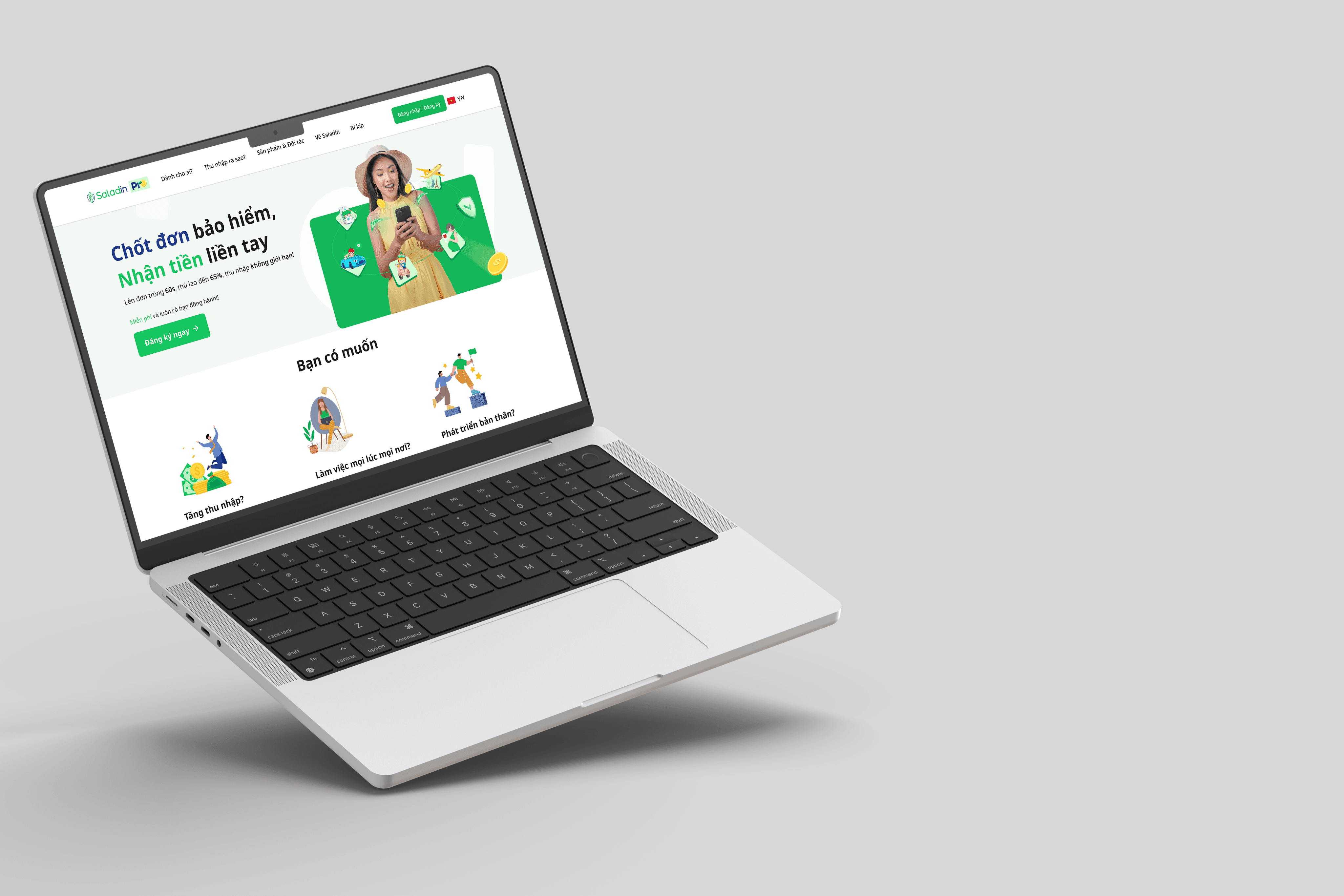
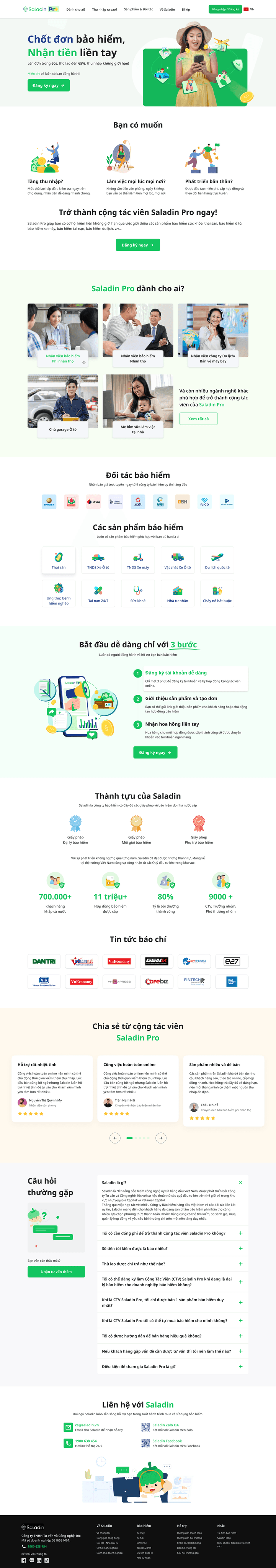
Landing page
Landing page is also a design item that needs to be refreshed to meet the marketing team's standards for content and SEO.